









You have probably already noticed it scrolling through your feed: the nail shades popping up in every fall preview look strangely familiar. Not a single neon surprise. No wild departure from last year. And yet something feels different – quieter, more intentional, almost earthy. That subtle shift is exactly what top manicurists have been flagging for months, and it tells us more about where nail color is headed than any single viral shade ever could. The real story this season is not about one breakthrough hue. It is about six color families, muted finishes, and the art of editing down.
Where these predictions actually come from
Before we dive into specific shades, a useful reality check: nobody owns fall’s definitive trend. What we do have are forecasts published by beauty outlets, built from manicurist observations and brand collections. The six color families discussed here are the ones that surface across three independent sources published in summer 2026 – Marie Claire US, which interviewed five manicurists including Andrea Forero and Gina Eppolito, The Everygirl, and Bright Side.
When a shade appears in all three, it carries real weight. That cross-referencing is what separates a passing Instagram moment from a color you will actually see requested at the salon chair week after week. So what made the cut? Browns, burgundies, terracotta, greens, deep blues, and warm nudes. No rupture from the previous year, but a clear movement toward more muted, earthier tones carried by matte and chrome finishes rather than bold, saturated color.
The six shade families reshaping your fall manicure
Browns lead the pack as the most universally cited family across all three sources. The range is wide: greyed-out taupe, milk chocolate, very dark espresso. Marie Claire flags a pearlescent or metallic finish variant that prevents the color from looking flat on lighter skin tones. If you have ever dismissed brown polish as boring, this season’s textured versions might change your mind entirely.
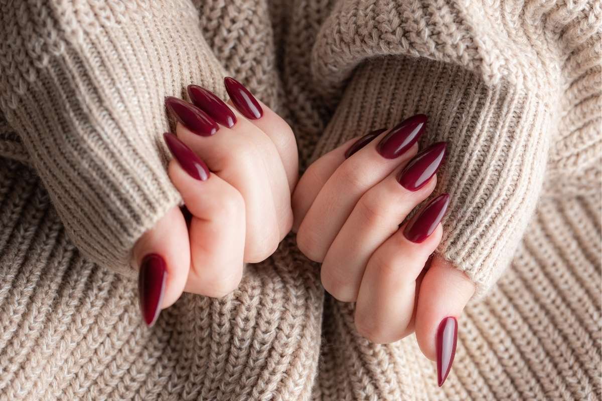
Burgundy remains the perennial fall staple – it simply does not move. What shifts around it is the neighborhood: dusty plum, very dark brown-burgundy, deep wine sometimes paired with gold leaf accents in nail art. It is the shade family that feels effortlessly seasonal without requiring any explanation.
Terracotta is the family that demands the most thought before committing. It sits beautifully on golden and matte complexions, but it can pull orange on very fair skin with pink undertones. Testing it on a single nail before going all in saves disappointment. Think of it as the shade that rewards a moment of patience.
Green is where hesitation peaks. Most people love it in theory but stall when it is time to choose. Muted versions – olive and sage – land better with a cautious audience than saturated emerald. Proposing green as an accent on just one or two nails often breaks the mental barrier without the commitment of a full set.
Deep blues round out the darker end of the spectrum, and Marie Claire highlights an interesting adjacent option: smoky grey in either a jelly translucent version or a full-coverage glossy finish. For many, this feels genuinely new without being risky. And finally, warm nudes anchor the palette, offering a quiet counterpoint to all those moody darks and serving as the perfect base for graphic nail art.
How to actually wear these shades – and what to watch for
A matte finish requires a specific matte top coat; you cannot achieve that velvet effect simply by altering your application technique. If you are exploring the Cat Eye magnetic look, keep in mind that the magnet is never included with the polish – it is a separate tool you need on hand before you start.
For the darkest shades of the season – burgundy, espresso, and deep forest green in particular – application matters more than you might expect. These colors are the least forgiving when layered on too thick: the polish stays soft beneath the surface and lifts at the edges. Two thin coats hold up significantly better than one heavy one. It is a small adjustment that makes a noticeable difference in wear time.
Accent shades deserve a mention too. Not every color needs to dominate all ten nails. A vibrant electric blue or an unexpected mustard, for instance, does not appear in any of the three forecast lists as a seasonal staple. But placed on one or two nails – blended into a gradient with taupe or used in graphic nail art over a nude base – these outliers find their purpose. Presented as accents, they work. Positioned as the color of the season, they tend to sit untouched.
Your fall palette, simplified
The bottom line is refreshingly straightforward. Fall 2026 is built on muted colors and intentional finishes, not on unprecedented shades. Five to eight well-chosen references are enough to cover the entire season, provided they span different families rather than clustering around slight variations of the same tone. It is the contrast between shades that makes a color lineup feel curated rather than cluttered. Browns and burgundies sit at the top of every forecast, greens work best as accents, and warm nudes tie everything together. You do not need twenty bottles. You need six directions and the confidence to edit.