









 Floral
prints carry a seasonal reputation they have never quite
deserved. Spring claims them, summer borrows them, and by September
most people fold them away. This year, however, the calendar has
been ignored. Flowers turned up across the fall collections in a
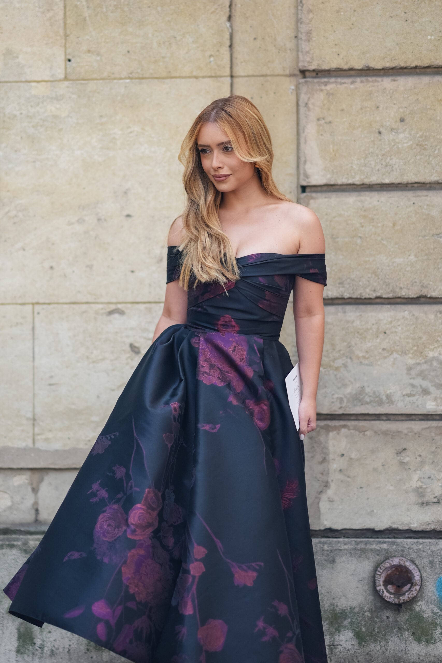
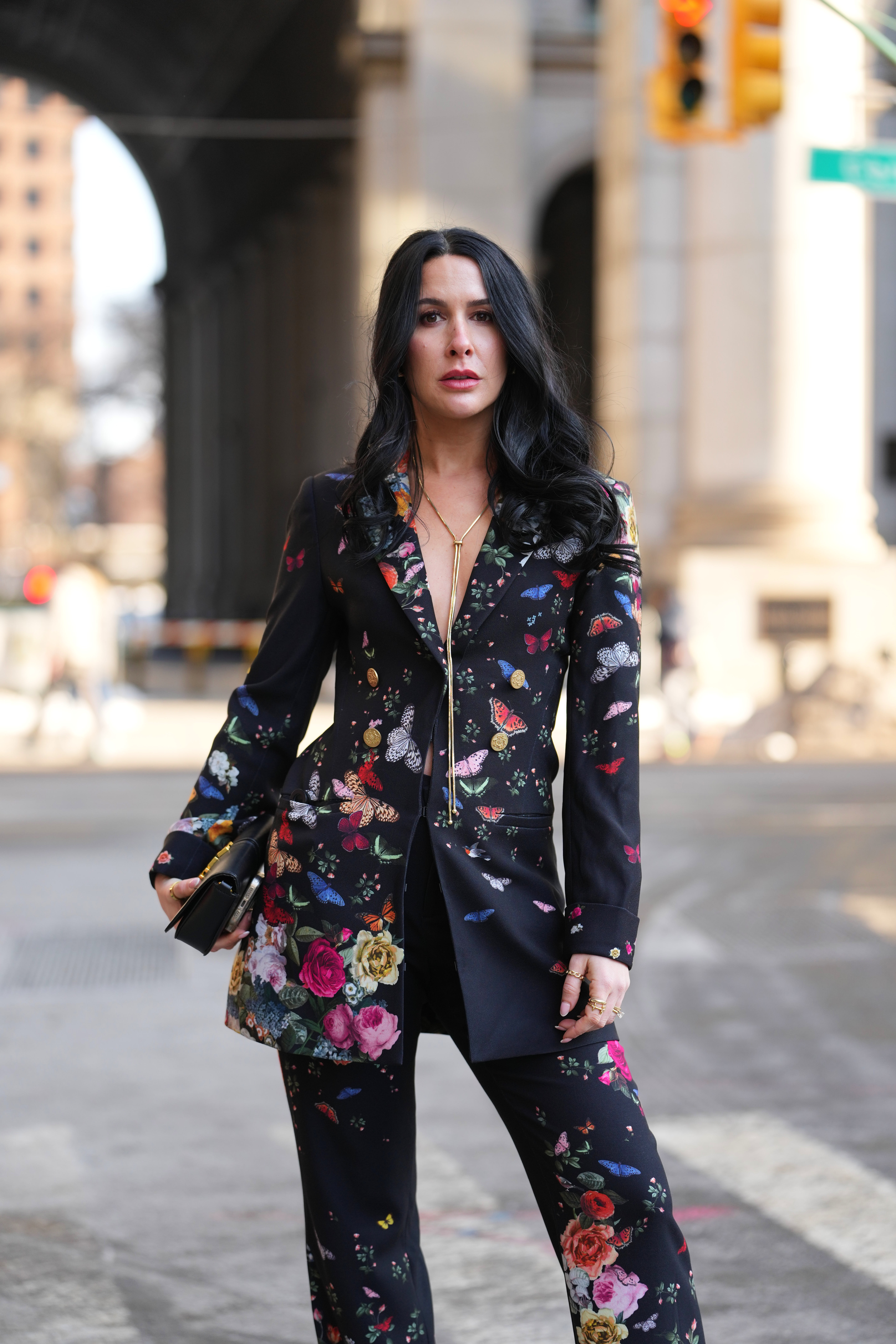
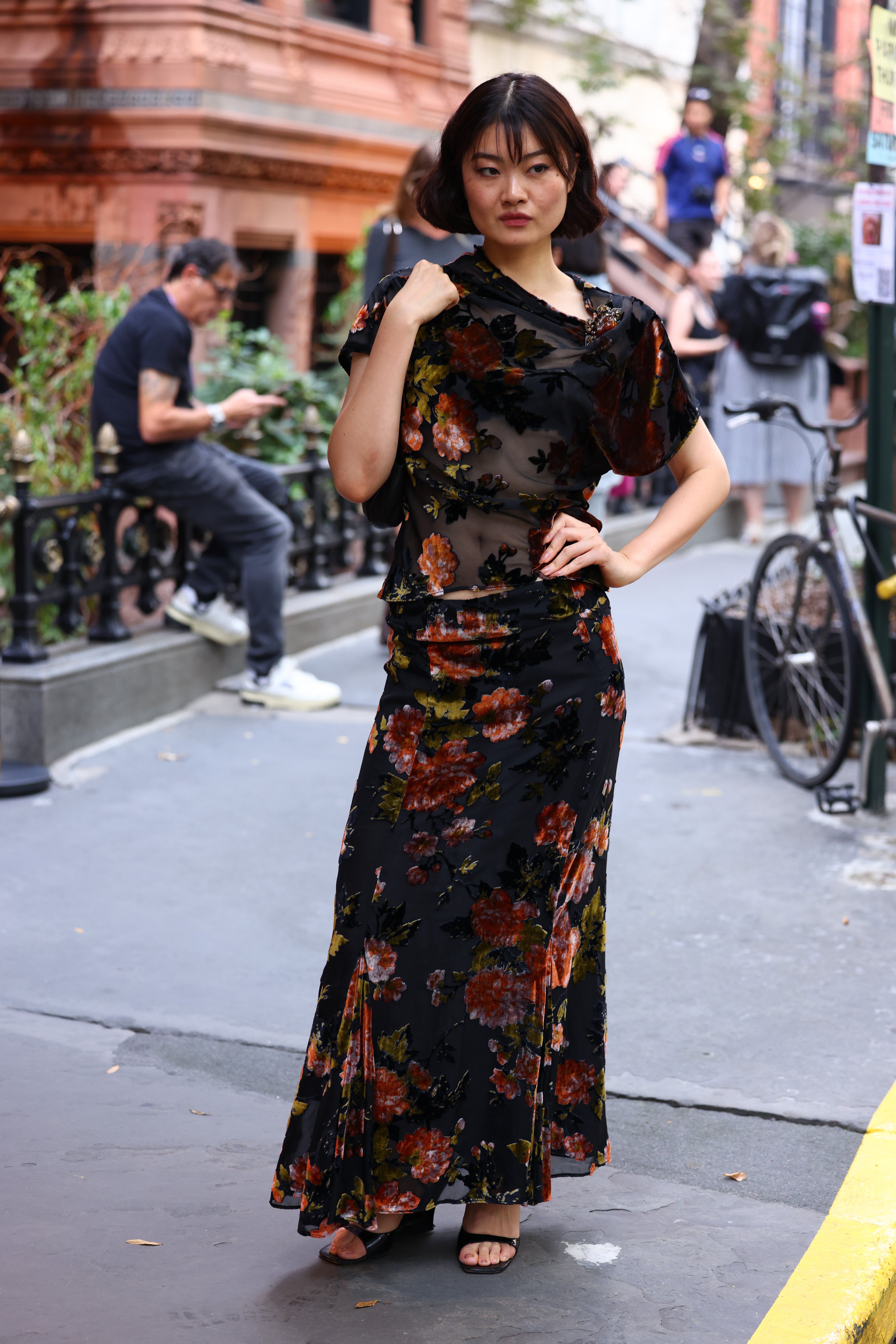
considerably darker register, printed on velvet and silk rather
than cotton. The grounds went black and burgundy, while the blooms
themselves grew larger and looser. Consequently the whole
proposition changed. A flower on a dark background behaves
differently from one on a pale ground, since it reads as rich
instead of fresh. That single shift is what carries the print
through October and well beyond it.
Floral
prints carry a seasonal reputation they have never quite
deserved. Spring claims them, summer borrows them, and by September
most people fold them away. This year, however, the calendar has
been ignored. Flowers turned up across the fall collections in a
considerably darker register, printed on velvet and silk rather
than cotton. The grounds went black and burgundy, while the blooms
themselves grew larger and looser. Consequently the whole
proposition changed. A flower on a dark background behaves
differently from one on a pale ground, since it reads as rich
instead of fresh. That single shift is what carries the print
through October and well beyond it.
Why Dark Florals Belong to Autumn
Painters established the principle four centuries ago. Dutch
masters of the seventeenth century built careers on flower pieces
set against near-black grounds, letting a single tulip glow out of
the shadow. Fashion borrowed the logic eventually.
Liberty opened on Regent Street in 1875 and turned
the small-scale floral into a British institution. Dries
Van Noten, meanwhile, spent a career proving that a flower
could look entirely serious.
Even the jokes have aged well, because in The Devil Wears Prada Miranda Priestly dismisses the category with one withering remark about florals and spring, and the scene still circulates every March. Her verdict, as it happens, was always a question of background.
How to Wear Floral Prints This Fall
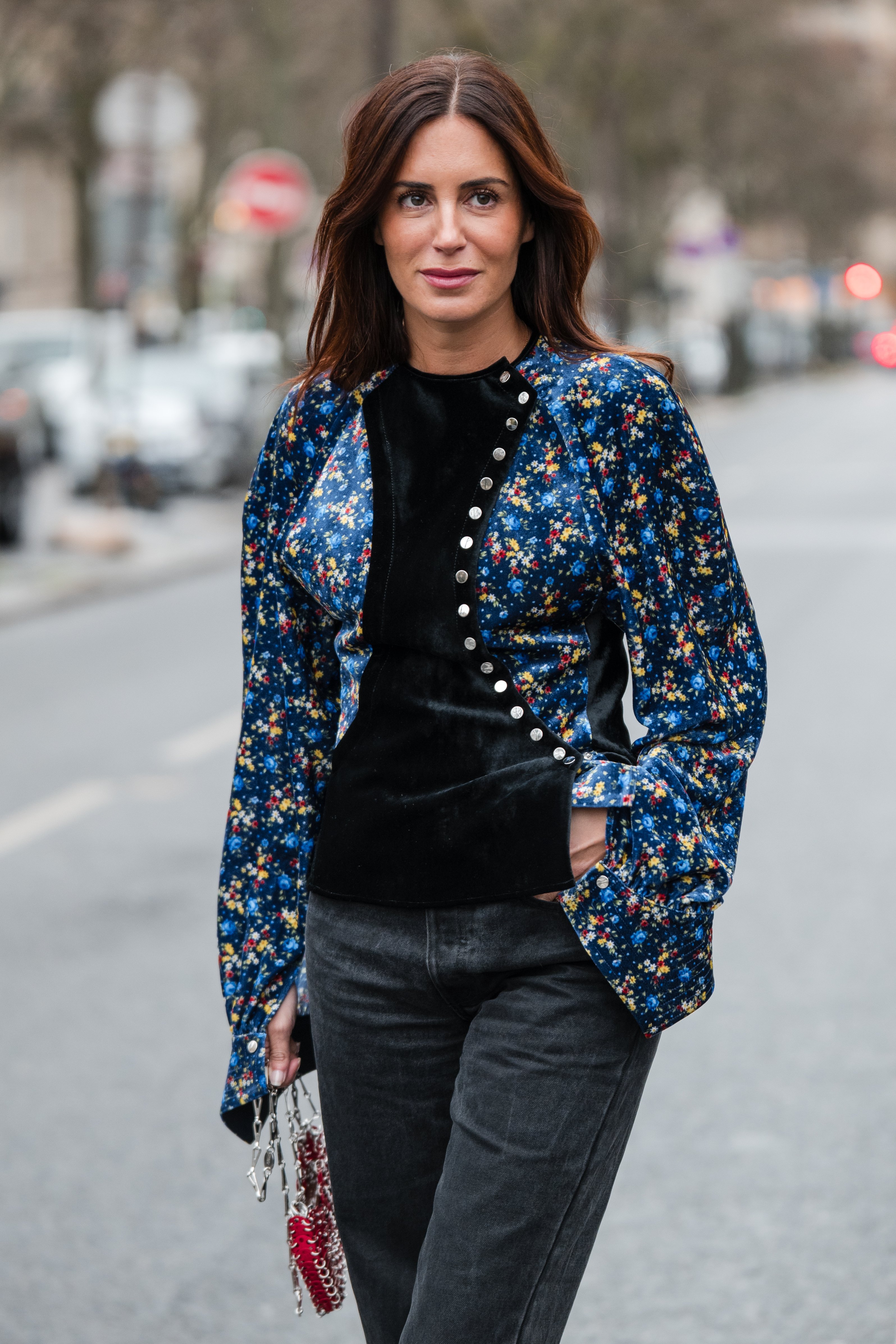
Weight decides everything here. A floral in velvet
or heavy silk arrives with autumn already built in, while the same
print in cotton poplin still belongs to July. Scale matters nearly
as much, so choose either a very small repeat or a very large one.
Layering handles the rest. Slip a floral dress over a fine-gauge
turtleneck, then add opaque tights and a boot with some heft.
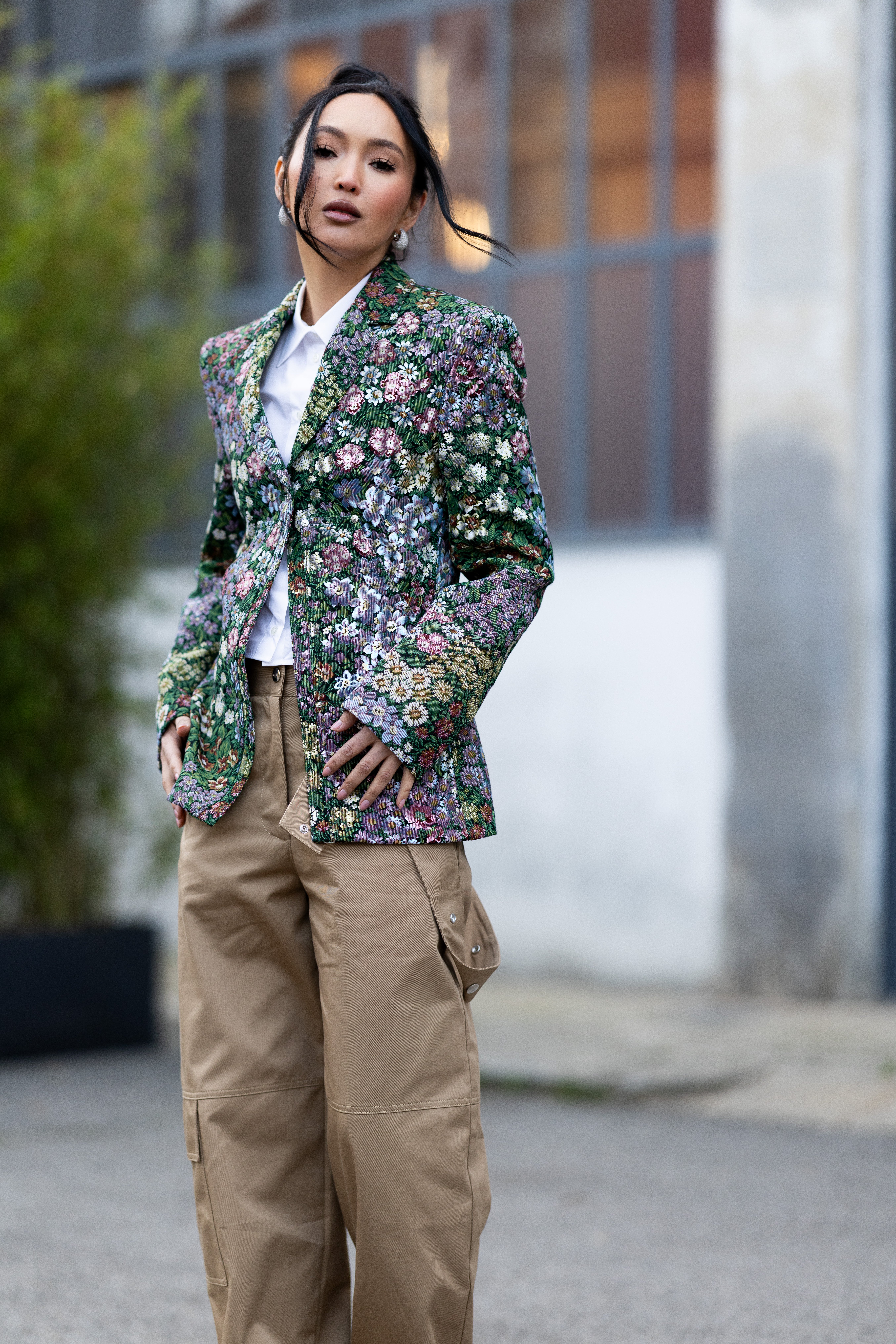
A leather jacket thrown on top removes any lingering sweetness. Print mixing works too, provided the palette stays narrow, which means a floral skirt beside a check jacket in the same color family. Keep the accessories plain and let the pattern speak. Worn this way, the print stops referring to summer altogether, and starts looking like something that chose to bloom out of season.


