Newsfeed

“Reflection, both as a visual technique and as a metaphor, plays a key role in my work, creating a balance between heritage and modernity,” declares Emirati artist Amal Al Gurg. Fittingly so, as the Emirati artist gears up to unveil one of her most exciting and storied pieces to date.
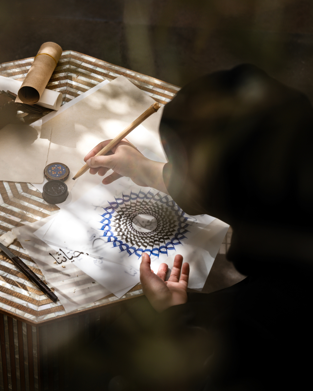
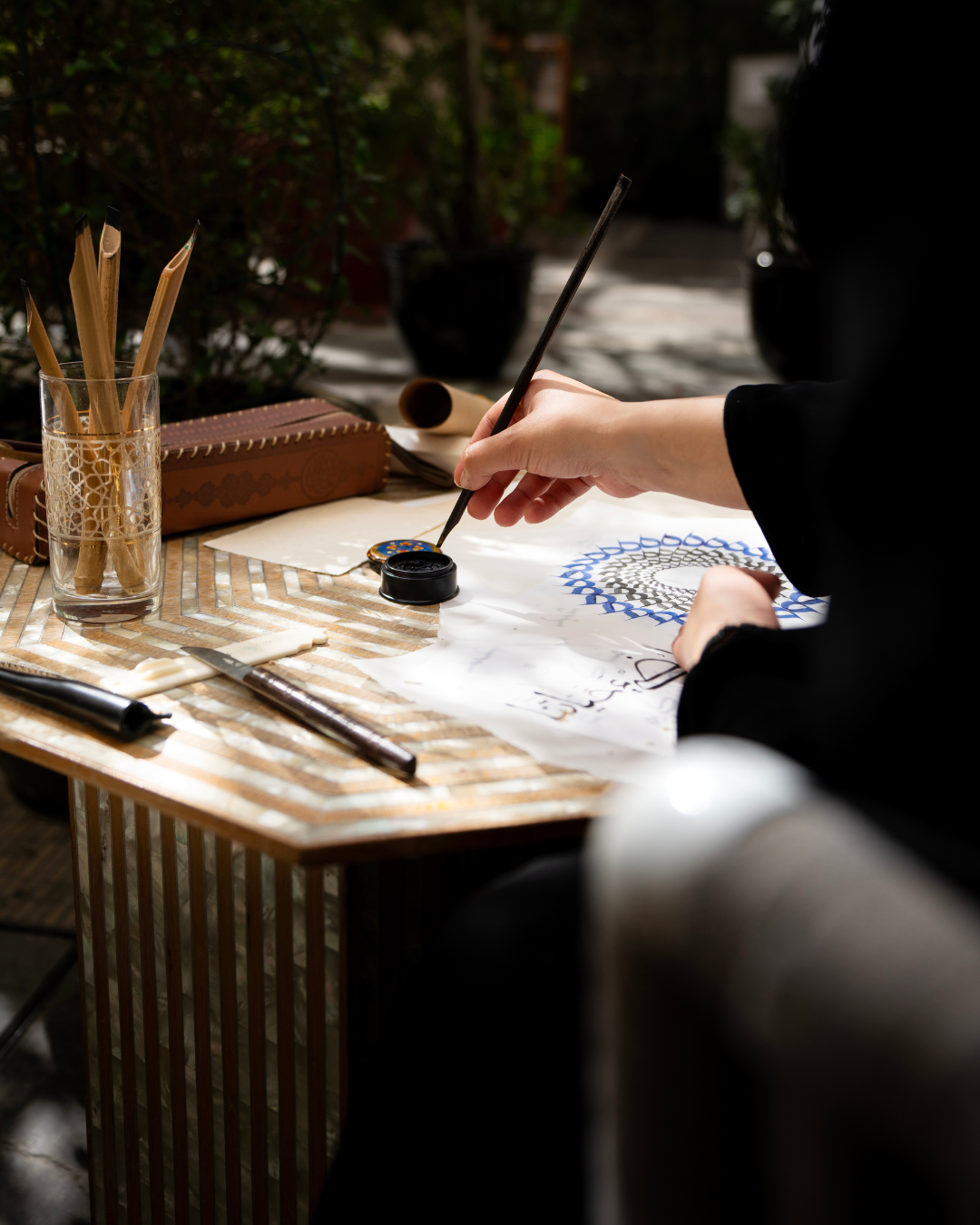
Entitled ‘Harmonious Silence’, Al Gurg has collaborated with Van Cleef & Arpels to mark the Holy Month of Ramadan with a piece which fuses artistry, calligraphy and celestial symbolism. Renowned for her intricate reflections of Arabic letters, Al Gurg draws inspiration from the quiet poetry of repetition – where shapes, words and meanings intertwine like constellations in the night sky. Always ensuring a “visual dialogue” is evident in her work, Al Gurg uses a repetition of circular sukoons to form radiant sunrays. Just as the sun marks the beginning and end of each fasting day, her creation radiates a profound sense of unity.
“Repetitions and tessellation usually draw the viewer in, which would evoke a sense of inner reflection while observing the work,” Al Gurg asserts. “To me, it brings a sense of calm and serenity; that’s what I’d like people to experience while appreciating the message behind the work.”
Ahead of the Holy Month of Ramadan, the Emirati artist sat down with GRAZIA to share an insight into her career, how reflections play a huge role in her work, and the inspiration behind ‘Harmonious Silence’.
THE CAREER
“Having a background in graphic design shaped my understanding of the powerful effect of visuals. Merging Arabic calligraphy and printmaking, namely serigraphy [screen printing], I was able to develop a distinct artistic language that draws from both traditional processes and ideas. As my body of work continued to grow, so did my participation in exhibitions, auctions and collaborations. [Master calligrapher] Majid Alyousef has really taught me to pay attention to detail and be patient with myself. His modern approach to teaching calligraphy encouraged the merge between modern design and classic style.”
THE ARTISTIC STYLE

“My Emirati heritage is deeply woven into my artistic style, particularly in the use of Arabic calligraphy and reflections. Growing up here in the UAE, I developed a deep appreciation for the elegance of Arabic script and its ability to convey both meaning and movement. Rather than using calligraphy in a purely traditional sense, I reimagine it in a modern, abstract way, blending it with contemporary design elements to create a visual dialogue.”
THE ROLE OF STORYTELLING
“Storytelling plays a crucial role in not only this collaboration, but in all of my works. I believe it is one of the pillars of creating a beautiful narrative. In this particular collaboration, I wanted to convey the reflections of mindfulness through the use of the sukoons. For this piece, as the sun marks the beginning and end to the day, I found that using it as a form to represent the spirit of Ramadan was on point. Taking into consideration that it is when we abstain from food, drink and other habits, the sense of serenity and calm are found during the very delicate moments before dusk and dawn. I wanted to visually translate the two prominent emotions of harmony and stillness experienced during Ramadan with what I enjoy most in my practice – language. I also took the literal shape of the sun and abstracted the forms of the sukoon to be able to recreate my own interpretation of the sun for Van Cleef & Arpels.”
HARMONY & STILLNESS TAKE CENTRE STAGE “
“The use of the sukoon, a calligraphic accent, reflects the concept. When the sukoon is used, it actions silence and stillness, which are prominent aspects of practicing throughout Ramadan and calligraphy. Harmony and stillness come with patience, which is a huge aspect of practicing calligraphy. This is why I think the sukoon is relevant. Repetition and silence play a huge part in my creative process. Ramadan-specific pieces are usually approached from a very personal point of view that others can relate to. Relatable emotions, moments and memories are usually a focus for such pieces.”

THE THEMES OF LIGHT AND NATURE
“The whole artwork revolves around these two elements. The chosen sukoon accent (which takes on various shapes in different scripts) and the composition of the work was intentional to showcase the emanating rays of light. The colour choices for the piece were inspired by the evenings in the desert. Green for the palm trees, deep blue for the night sky, and silver for the starry nights. That being said, the duality of a day symbol (the sun) with colour choices of a night setting adds further depth to the piece.”
THE PARALLELS OF CALLIGRAPHY & FINE JEWELLERY
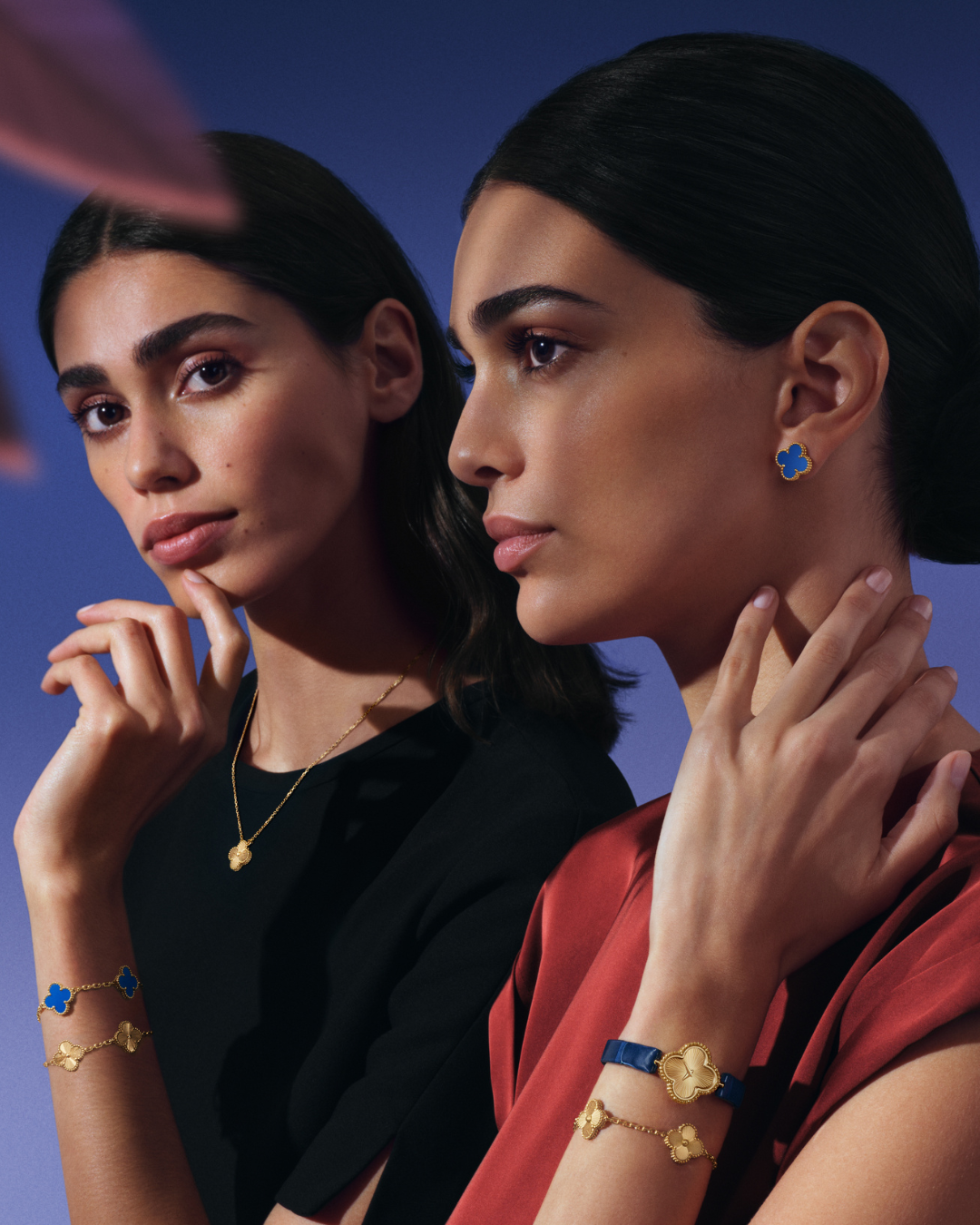
“I like to think there’s a kinship with how the Maison creates their pieces and my approach to making my work. The attention to detail when making pieces in both jewellery and art, the patience in when creating, and the type of material used, are all similarities between the two. Bringing together the art of Arabic calligraphy and serigraphy with much love and dedication to the process of preparation feels like a meeting point with how Van Cleef & Arpels blend art and craftsmanship. All the above affect the outcome and work together as a whole. A great idea with weak craftsmanship is a lost opportunity. I hope that this collaboration helps showcase that using traditional art forms such as calligraphy and serigraphy can help add depth and value to modern luxury brands when done right. I feel there is a lot to learn from ancient art forms, and we can only begin to scratch the surface of how they can be interpreted in today’s world.


