
News feed

![]()
bassike’s iconic logo, three ways: the Australian brand has handed over the reigns so to speak to three local artists, asking them to interpret their signature dot and wordmark logo through their lens for a limited edition streetwear capsule dubbed bassike x.
Fans of bassike will be familiar with the ever-present dot that regularly makes its appearance on bassike’s quintessential T-shirt. But the history behind the concept, perhaps not so much. “We were working with Jonathan Zawada on our branding when we started,” explains Mary-Lou Ryan, who co-founded bassike with long-time friend Deborah Sams. “He had a reference of a black dot on cardboard packaging we were drawn to. We loved the simplicity and minimalism it symbolised. The scale and proportion of the dot are extremely important aesthetically – we have seen many iterations of this over the years but nothing feels more bassike than the oversized, solid black dot.”
Simple, direct, fuss-free – that dot embodies the sartorial ethos of bassike’s clothing. The capsule collection is, in many ways, paying homage to its contribution as a motif by celebrating the potential of its purpose.
“Each interpretation is unique to the artist and they are all completely different to each other,” says Sams. “I think this perfectly surmises what we strive to stand for as a brand – creative, universal, authentic, individual and open to interpretation. As a concept, we believe in the art of collaboration and this special project has allowed us to connect with and partner with creative and likeminded people with a new perspective.”
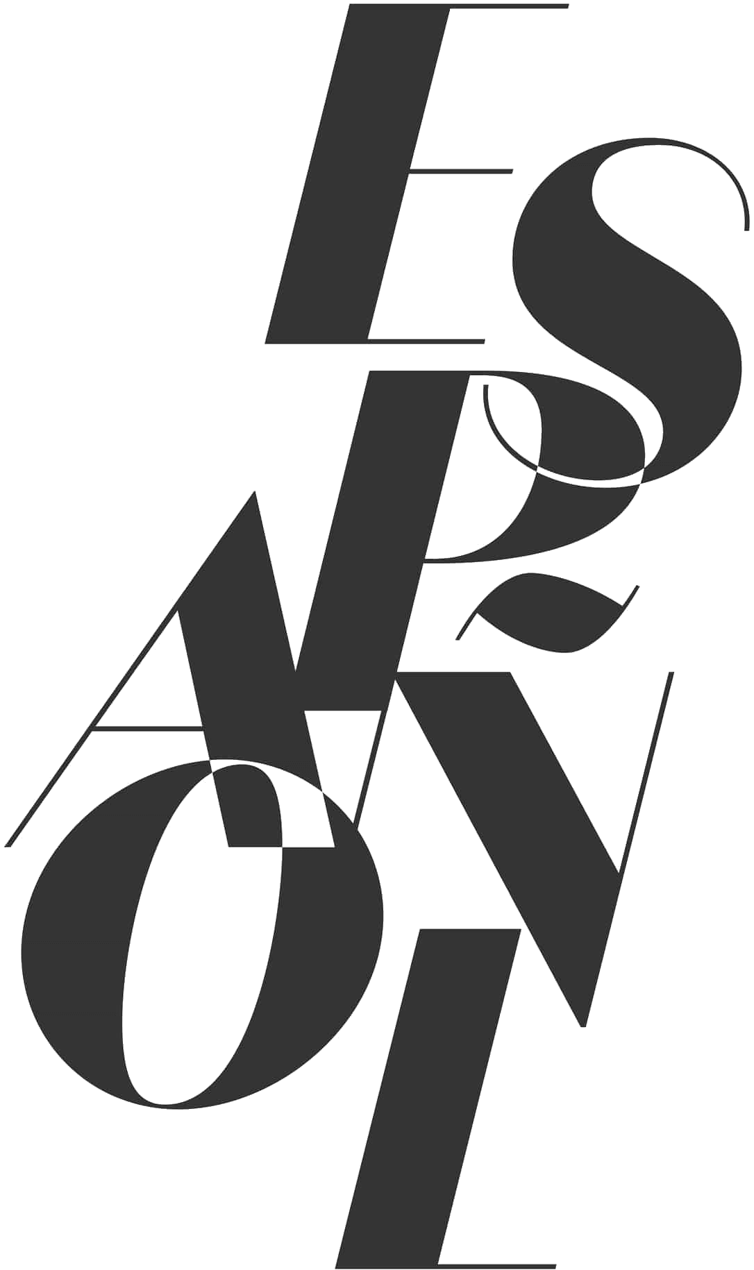
Photographer Kitty Callaghan, fine artist Bart Celestino and digital artist Quinn Carmichael have taken the familiar bassike black dot and transmuted it into something of a mirror, reflecting their own creative landscapes and aesthetics. For Celestino, this was a graphic, graffiti take on the brand’s name. The dot removed, but still reflected in the outline of the lettering’s invisible boundary. Callaghan crafted a fantastical garden of flora. Quinn delivered perhaps the most abstract concept, yet one that is still rooted in the Australian landscape.
“The Type face I created was heavily influenced by the Kangaroo Paw,” says Quinn. “Which is evident in its form and nuanced chromatic palette. The Kangaroo Paw’s influence is manifested, bridging the iconic Australian botanic with the contours of my artistic expression.”
According to Quinn, the choice of a Kangaroo Paw ties into his own artistic practice and love of Australian native flora. “When I began this journey, I delved into my formative origins as a creative and the captivating sources of that creative energy. Photography marked my initial artistic outlet, prompting discussions about early inspirations. During those initial years, my fixation centred on macro floral photography. My affection for flora, particularly Australian natives, materialised.”
Since Ryan and Sams first launched their label back in 2006, the brand has evolved to become more than just the coastal streetwear of its origins, inspired by the climate and lifestyles of Australia’s beach regions.
It began to define a new kind of luxury that was built upon principles of comfort, quality and an effortless approach to styling. Sustainability would soon become the fourth pillar that holds up bassike as one of Australia’s most premier brands, with the company becoming a certified B Corp back in 2022.
While the brand’s offering has expanded and contracted as needed – denim joining the lineup back in 2007, along with knitwear and leather becoming pillars alongside their signature jersey – the dot logo has been something that remains a consistent presence, manifested in various treatments.


