

News feed

After seasons lost in muted beige, the Spring/Summer 2027 runways in Paris and Milan staged a daring chromatic revolt. Six definitive shades have emerged to challenge stealth wealth, completely transforming how fashion approaches warm-weather dressing.
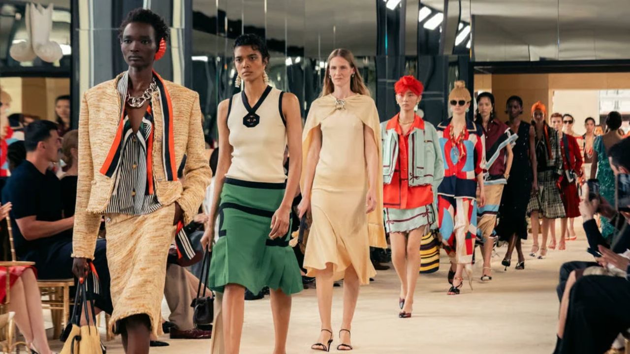
After what feels like an eternity of sensory deprivation under the banner of “quiet luxury” – an endless loop of oatmeal cashmere, safe camel separates and whisper-soft minimalism – fashion has finally broken its vow of silence. The Spring/Summer 2027 runways across New York, London, Milan and Paris staged an intentional chromatic rebellion. Rather than retreating into predictable palette cleansers, creative directors delivered an electric antidote to aesthetic fatigue: rich, expressive saturation anchored by high-art reference points.
This collective shift is neither chaotic nor carelessly loud. Instead, the upcoming summer palette provides an intelligent wardrobe recalibration designed to shine under uncompromising sunlight. Across the international shows, six definitive shades emerged from the runway circuit. Spanning pure primary fires, hypnotic aquatic depths and subversive earthy undertones, these colours signal a sophisticated departure from stealth wealth restraint, offering something infinitely more invigorating for the warm-weather season ahead.
The Saturated Statements: True Red and Blood Orange Heat Up the Runway
Red is hardly an unprecedented concept on the international runways, yet Summer 2027 strips the shade of its recent autumnal baggage. The moodier iterations that dominated previous cycles – the brooding oxbloods and deep cabernet tones – have officially retired. In their place arrives unapologetic, fire-engine true red. Bright, assertive and completely unbothered by subtlety, the shade demands presence without relying on intricate embellishment.
Crucially, the runway directive for true red involves a non-negotiable styling shift. The timid “pop of red” that ruled recent footwear and accessory trends has been superseded by head-to-toe monochromatic commitment. Whether interpreted through sharp poplin tailoring, fluid silk trousers or sculptural slip dresses, designers treated the primary tone as a complete silhouette rather than an afterthought.
Working in close harmony with pure scarlet is blood orange, a fiery, red-leaning citrus that captures the warmth of a lingering dusk. Moving far beyond the sugary pastels and delicate peach hues of prior years, blood orange possesses an inherently retro, Mediterranean depth. It lends itself exceptionally well to open knits, sweeping resort dresses and relaxed daywear that balances high visual energy with effortless summer ease.
Oceanic Impact: The Electric Charge of Yves Klein Blue and Psychedelic Aquamarine
On the cooler end of the spectrum, designers looked toward intellectual art history and surrealist holiday escapism. Leading this charge is Yves Klein Blue, the legendary ultramarine shade formulated by the French artist in the mid-20th century. Free from the corporate connotations of standard navy and brighter than conventional cobalt, this historic pigment commands immediate visual respect.
On the runway, Yves Klein Blue proved remarkably versatile. Styled against optic white, it created sharp, graphic contrast ideally suited to modern summer tailoring. When set alongside jet black or layered in fluid jersey, it delivered architectural drama. It is an unapologetically cerebral hue, lending artistic weight to warm-weather dressing without losing its striking visual punch.
If Klein blue represents artistic discipline, psychedelic aquamarine is its uninhibited counterpart. Sitting somewhere between tropical turquoise and deep crystalline water, this vibrant blue-green offers an otherworldly intensity. By abandoning the powdery, delicate qualities typically expected of warm-weather pastels, designers turned up the saturation entirely. The resulting shade feels hypnotic, lending tailored shirting and translucent chiffon an almost hyperreal sheen.
The Subversive Neutrals: Dirty Martini Chartreuse and Barely-There Beige
For devoted minimalists feeling slightly alienated by high-octane saturation, the runway offered two remarkably clever alternatives that operate as evolved neutrals. The most delightfully unexpected shade of the season is dirty martini chartreuse. Stripped of radioactive neon brightness, this yellow-green tone carries murky, olive-tinged brine undertones that lend it instant gravitas.
The secret to adopting this offbeat shade lies in treating it exactly like khaki or classic olive. Rather than positioning it as a jarring focal point, pair dirty martini chartreuse alongside rich chocolate brown, crisp ivory and dark slate grey. In lightweight linen trousers or structured summer blazers, it delivers a modern, slightly subversive polish that feels refreshingly contemporary.
Rounding out the seasonal forecast is barely-there beige, the ultimate nod to quiet refinement. Falling delicately between washed sand, bone and pale taupe, this nuance-heavy shade avoids the clinical stiffness of pure white and the warmth of traditional cream. It drapes seamlessly in raw silks, ribbed knitwear and tailored Bermuda shorts, proving that even as fashion embraces vivid colour, understated elegance still has a profound seat at the table.